
The Case of the Missing Profit: 6 Numbers I Want You Watching Every Month
Your financial statements shouldn't just explain what happened. The right numbers can help you spot what is changing while you still have time to do something about it.
There is a very traditional approach to managing school finances: run the school, pay the bills, keep enrolling children, glance nervously at the bank account occasionally, and then hand everything to the accountant at the end of the year to find out how you did.
I have some concerns about this strategy.
Your year-end financial statements and tax return can tell us a tremendous amount about what happened last year. Unfortunately, if we discover in March that your labor costs started climbing the previous August, our options for fixing August are rather limited. Unless someone has invented a time machine and neglected to notify the accounting profession, historical financial statements can only help us change the future.
That's why I want school owners looking at a small group of financial and operational numbers every month. If we look at August 2026, in September of 2026, we still can’t change what happened in August. But, we can make adjustments for September and October. These quicker adjustments can save your profit margin.
However, I don't want 47 KPIs, twelve dashboards, or a spreadsheet requiring its own employee handbook. I want a handful of numbers that help us answer a much more useful question:
How is the school doing—and is anything changing that we need to pay attention to?
For most schools, I would start with six: Enrollment & Capacity, Revenue Trend, Forecast vs. Actual, Labor %, Net Margin, and Cash.
The important part isn't simply knowing what those six numbers are. It's learning how to read them together.
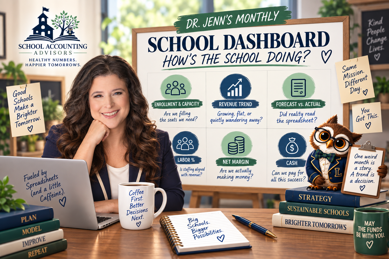
1. Enrollment & Capacity
The first number I want to see every month is enrollment, but I don't just want someone to tell me, “We're pretty full.” Pretty full is a perfectly acceptable description of my coffee cup. It is not a financial metric.
If your school has room for 120 children and has 94 full-time-equivalent enrollments, now we have information we can work with. Even then, I don't want to stop at the whole-school number. I want to know where the empty seats are, because a school can look extremely busy while individual classrooms tell very different financial stories.
Maybe your preschool rooms are full while your toddler rooms have substantial capacity. Perhaps one classroom has four open seats that could be filled without adding another teacher, while another is one child away from triggering an additional staffing requirement. Those aren't equivalent opportunities. Enrollment and staffing ratios interact, which means the financial value of the next child can be very different from one classroom to another.
This is also why I care so much about the trend. Suppose occupancy was 88% in January, 87% in February, 84% in March and 81% in April. If we only look at April, we know occupancy is 81%. If we look at all four months, we know something more important: we're heading in the wrong direction.
Now we can ask useful questions. Are more children aging out than we're replacing? Have inquiries dropped? Are tours happening but not converting? Has a competitor entered the market? Is the issue concentrated in one age group? We don't necessarily know the answer yet, but the trend has told us where to start looking.
I'm going to devote a future School Finance Insights article to classroom-level capacity and the financial value of an empty seat, because there is much more to unpack here. We'll look at how to determine which rooms have financially valuable capacity, when another enrollment improves margin, and when another child also triggers enough additional expense to change the answer.
For now, remember this:
One number tells us where we are. A trend starts telling us where we're going.
2. Revenue Trend
Revenue is obviously important, but one month's revenue by itself can be surprisingly misleading. Childcare and school revenue moves around for perfectly ordinary reasons: registration fees, annual tuition increases, subsidy timing, school calendars, enrollment cycles, vacations, and the occasional government payment that appears to be traveling to your bank account by covered wagon.
That's why I like looking at a rolling average of revenue rather than reacting dramatically every time one month moves.
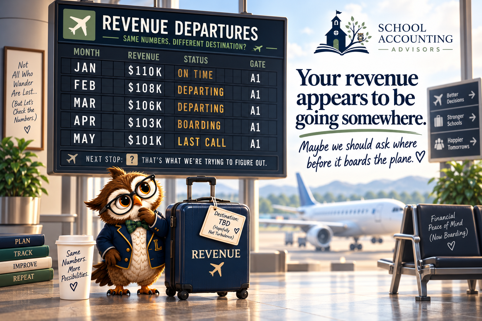
Imagine revenue over five months looks like this:
$110,000 → $108,000 → $106,000 → $103,000 → $101,000
None of those months individually screams catastrophe. If someone showed me only the $101,000 month, I would need more information before drawing any conclusions. Put all five together, however, and our revenue has packed a small suitcase and appears to be heading somewhere.
I'd like to catch it before it reaches the airport.
A rolling average smooths out some of the normal month-to-month noise so we can see the larger direction. Once we see a downward trend, we start investigating. Maybe enrollment has fallen. Perhaps the mix of enrolled ages has changed. Maybe discounts have grown. Maybe receivables aren't being collected. Maybe nothing is fundamentally wrong and we've simply encountered a predictable seasonal pattern.
That's the job of a good dashboard. It doesn't make the decision for us. It tells us where we need to ask the next question.
3. Forecast vs. Actual
Forecast versus actual may be my favorite dashboard measurement because it changes the conversation from “What happened?” to “What did we expect to happen, what actually happened, and why were they different?” That is a much more powerful way to manage a business.
Suppose we forecast $125,000 of revenue for the month, but actual revenue was $100,000. The least useful response is to stare accusingly at the budget as though it has personally disappointed us. Budgets do not require disciplinary hearings.
Instead, I want to know why we're $25,000 below forecast. Were children expected to enroll who didn't? Was subsidy revenue delayed? Was enrollment exactly where we expected, but average tuition revenue lower? Did we offer more discounts than anticipated? Or was the original forecast simply based on an assumption that turned out to be wrong?
That last possibility is important because a forecast is not a prophecy. It's our best estimate of the future based on what we know today. When actual results arrive, we have new information. We compare the two, investigate meaningful differences, and improve the next forecast.
That's how the cycle should work:
Plan → Measure → Understand → Adjust → Repeat
The spreadsheet isn't angry that reality didn't follow instructions.
It would just like to know why.

Okay, Jenn. How Do I Actually Do This in QuickBooks?
This is one of those situations where I don't need to create a tutorial explaining which buttons to click when the people who make QuickBooks already have one.
QuickBooks provides official training materials for creating budgets and comparing budgeted amounts with actual results in QuickBooks Online. If you haven't used the Budget vs. Actual report before, I'd start there rather than trying to reverse-engineer the software from a blog screenshot.
I'll cover the school-specific side in a future School Finance Insights tutorial: how I would structure the budget, which categories I care about, what variances deserve investigation, and how I use those results to update a forecast. In other words, QuickBooks can show you where the buttons are.
I'll show you why I care about what comes out of them. Fair division of labor.
4. Labor %
Labor is usually one of the largest expenses in a school, which means relatively small changes can have a substantial effect on profitability. But I want to be careful about how we talk about this metric because “labor is too high” can very quickly turn into “employees cost too much,” and those are not the same statement.
Your teachers and staff are doing difficult, important work. You want excellent employees, competitive compensation, reasonable benefits, and enough staff to provide safe, high-quality care. I want those things too. What we need to know is whether the school's revenue model can financially support the staffing model we've chosen.
That's why I generally want to look at total labor cost as a percentage of revenue. And when I say labor, I don't mean wages alone. Payroll taxes, benefits and other employee-related costs belong in the conversation too.
If labor percentage begins climbing, the number doesn't automatically tell us what to do. It tells us to investigate. Perhaps wages increased intentionally. Maybe overtime is creeping up. Maybe the school hired ahead of expected enrollment. Perhaps enrollment declined while schedules stayed the same. Or maybe staffing hasn't changed at all—revenue fell, which caused labor to become a larger percentage of it.
Those situations require very different decisions.
A benchmark is useful because it can wave its little accounting hand and say: “Dr. Jenn, you may want to look over here.” It is not authorized to start firing people.
5. Net Margin
Net margin answers the question at the heart of Post #4: after the school earns its revenue and pays its expenses, are we actually making enough money?
If the school generates $120,000 in revenue and has $114,000 in expenses, that's $6,000 of profit. Divide the $6,000 by $120,000 of revenue and we have a 5% net margin.
The calculation is straightforward. Interpreting it is more interesting.
One month's margin might look strange because you paid annual insurance, replaced equipment, collected registration fees, or had another unusual event. That's why—once again—I care more about the pattern than I do about a lonely number sitting in a spreadsheet.
If net margin moves from 10% → 9% → 8% → 6% → 4%, something is changing.
At that point, I go back to our three-legged stool from Post #4: Enrollment & Capacity, Tuition Pricing, and Employee Pay & Benefits. Maybe the answer isn't one of those three, but they're excellent suspects.

6. Cash
Yes, cash is back.
At this point, Cash should probably have its own parking space.
As we discussed earlier in this series, profit and cash are not the same thing. Your P&L can show a healthy profit while the bank account is considerably less enthusiastic, which is why cash still belongs on the monthly dashboard even after we've spent entire articles discussing reserves and cash-flow forecasting.
I want to know how much cash we have today, how that compares with previous months, how much we've built in reserves, and—most importantly—what we expect the balance to do next.
Suppose there is $150,000 in the bank today. That's lovely. But if $90,000 will leave over the next several weeks and we expect only $40,000 to come in, then celebrating the $150,000 without looking forward would be rather like checking the gas gauge at the top of a road trip and declaring transportation solved.
The balance matters. The direction matters more.
Now Put the Six Numbers Together
This is where the dashboard becomes much more powerful than six individual metrics.
Imagine enrollment starts falling. Revenue doesn't change immediately because of billing timing, but a month or two later it begins to decline. Staffing hasn't changed, so labor becomes a larger percentage of revenue. Net margin starts shrinking. Eventually, cash begins falling too.
Those aren't six unrelated financial problems.
They're six chapters of the same story.
If we're reviewing the dashboard every month, we might notice that story in Chapter One when enrollment begins softening. We can investigate what's happening and decide whether we need to act.
If we wait for the tax return, we'll still get the story.
We'll just get the ending first.
Personally, I prefer spoilers when the plot involves payroll.
Please Don't Turn This Into Another Full-Time Job
Once owners discover KPIs, there is a natural temptation to track everything.
Resist.
You do not receive bonus accounting points for having 37 metrics. If it takes three hours every month to assemble a dashboard that nobody understands and everyone quietly avoids opening, we have not improved financial management. We have invented a new administrative burden.
For each of the six numbers, I really want five things:
Current result. Target. Prior periods. Trend. Question.
That's enough to turn a number into a management tool.
If enrollment is 82%, the target is 90%, and the last four months show a steady decline, I know we need to investigate enrollment. If labor is 58% against a 55% target but revenue is temporarily down because of three delayed enrollments, I have context before making a staffing decision. If net margin is declining while enrollment and labor remain stable, perhaps tuition or another expense category deserves our attention.
We aren't trying to create the world's most impressive spreadsheet.
We're trying to see the school clearly.
And Please Don't Panic Over One Weird Month
Numbers move. One month of higher labor doesn't automatically mean you have a labor problem, just as one month of lower revenue doesn't automatically mean enrollment is collapsing. Maybe you paid bonuses. Maybe three teachers happened to be out at once. Maybe you bought equipment. Maybe January was January.
Sometimes accounting is just weird.
That's why the phrase on Ledger's dashboard matters:
One weird month is a story. A trend is a decision.
If something changes once, I want to understand it.
If it changes repeatedly, I want to decide whether we need to do something about it.
And if it changes repeatedly while nobody is looking?
Well, that's how numbers eventually learn to yell.
Your Numbers Should Help You Run the School
This is really the larger point of everything we've been discussing in School Finance Insights.
Accounting shouldn't exist only because the IRS would eventually like some paperwork from you. Your financial information should help you answer practical questions while you still have choices: Are we financially healthy? Is revenue growing? Is our staffing model sustainable? Do we have enough enrollment? Are we actually making money? Are we building cash? Are we performing the way we expected?
Most importantly:
Is something changing?
The goal isn't to turn school owners into accountants. Please don't. I already have that job and I like it.
The goal is to give you enough financial visibility to recognize when something deserves your attention before the situation makes the decision for you. Because when we're looking at the right numbers regularly, a financial problem doesn't have to arrive with sirens, flashing lights and an emergency meeting.
Sometimes the spreadsheet can simply tap you on the shoulder and say: “Hey. You might want to look at this.” That's a considerably cheaper conversation, especially if you have it before the trend repeats for 9 months completely unchecked.
What's Coming Next
We've now identified the numbers I want on your monthly dashboard. In upcoming School Finance Insights posts, I'm going to start breaking down the technical pieces individually, including how to build a useful school budget, how to interpret forecast-to-actual results, how to calculate classroom-level capacity, and how to build a cost-of-care model.
Those will include examples and practical walkthroughs rather than simply telling you to “know your numbers.” Because while that's excellent advice, it's also approximately as helpful as telling someone to “just make more money.” I'd rather show you how.
Better Numbers. Better Decisions. Stronger Schools.
At School Accounting Advisors, we help childcare centers and independent schools turn accounting reports into information they can actually use. That means going beyond producing a P&L and helping owners understand what enrollment, revenue, labor, margin, cash and forecasts are telling them about the business they're running. BOOK A FREE CONSULT →